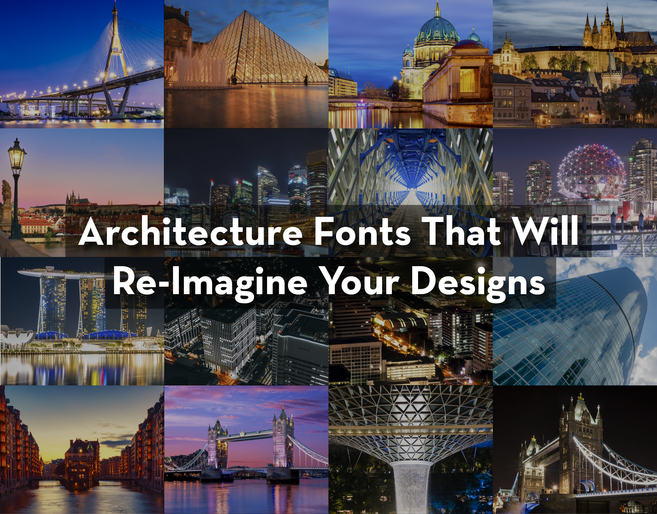
Architecture in most of our minds is mostly about designing building structures. But what’s ignored is the fact that the process of creating structures that are not just aesthetically appealing and useful is often a long, tedious, and frustrating process. One of the frustrating parts is choosing the right architecture font.
Let’s face it, a good or bad font can make or break your project as it individually contributes to its presentation and level of engagement. But, selecting the right font for your current or upcoming architecture project can be a stressful process, especially when you don’t have a few go-to options. So, here we bring for you a list of 15 top-class architecture fonts that will re-image your architecture designs.

http://wendykeithdesigns.co.uk/image-browser.do?i=3 1. Bauhaus
Bauhaus is a decorative font with simple geometric forms and even strokes which give the font a clean and idiosyncratic look. Graphic designer Herbert Bayer developed this font in 1925, it is used even today. As an architecture font, it is mostly ascribed to titles and subtitles in the composition of boards.

cenforce avis 2. Futura
Futura is one of the most popular fonts which has a modern look and feel, and of course delightful characteristics. In 1920, Paul Renner created this font and since then it has been one of the architect’s all-time favorites. This font is inspired by Bauhaus techniques, it uses straight lines and curves which are perfect to provide balance in a textual set. Futura is perfect for titles, subtitles and short paragraphs on your architectural drawings, but should be avoided in long texts.

Seonghwan 3. Neutra
Neutra is very popular and highly used as an architecture font. This font was created by graphic designer Christian Schwartz in honor of the world-renowned modernist architect Richard Neutra. While creating this font, iconic architectural photographer Dion Neutra and Julius Schulman participated in the process.
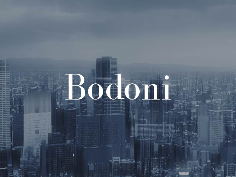
buy gabapentin tablets 4. Bodoni
Created by Giambattista Bodoni way back in 1767, Bodoni is categorized by its high aesthetic strength and needs to be used with great caution. Owing to the set of lines and striking presence of its letters, it is not suitable for long texts, but great for highlights, including titles and details.
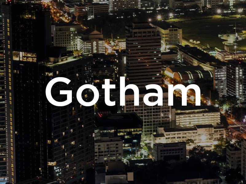
5. Gotham
Gotham is one of the most loved architecture fonts. The letterforms of this font are influenced by a sort of architectural signage which achieved acceptance during the mid-20th century. it was conceived in the 2000s by designer Tobias Frere-Jones. Gotham provides a relatively broad style and design having a fairly large x-height and large apertures and is widely used for publicity.
6. Butler
Butler is a free serif typeface which is inspired by a mix between both Dala Floda & the amazing Bodoni font styles. Butler comprises of modern typography along curvilinear lines. Owing to its strong personality, it is perfect for logos and titles.
7. Consolas
Designed by Luc de Groot, font Consolas is a monospaced typeface. Extensively used for long texts, this font renders clean aesthetics and proportion of lines which is perfect for long readings without tiring the reader. This font is also widely used in books and expert Architecture magazines.

8. Lato
Used on more than 9.6 million websites, Lato is the 3rd most served font on Google Fonts, with over one billion views every day. Lato was designed by font designer Łukasz Dziedzic in 2015. It is a free humanist sans-serif typeface which is being widely used as an architecture font.
9. DIN 1451
DIN 1451 uses all the principles of the Bauhaus font style, it has very strong characteristics that make it perfect for architecture use. The font creates a strong form and mass when used as a text in paragraphs. This typeface is widely used for traffic, administrative and technical applications.
10. Poplar
This font presents strength and personality in its composition. It was designed by Barbara Lind and is a part of Adobe. Poplar is perfect for a wide range of applications, including boards, diagrams, and schemes. It is also suitable for titles, subtitles, and details.
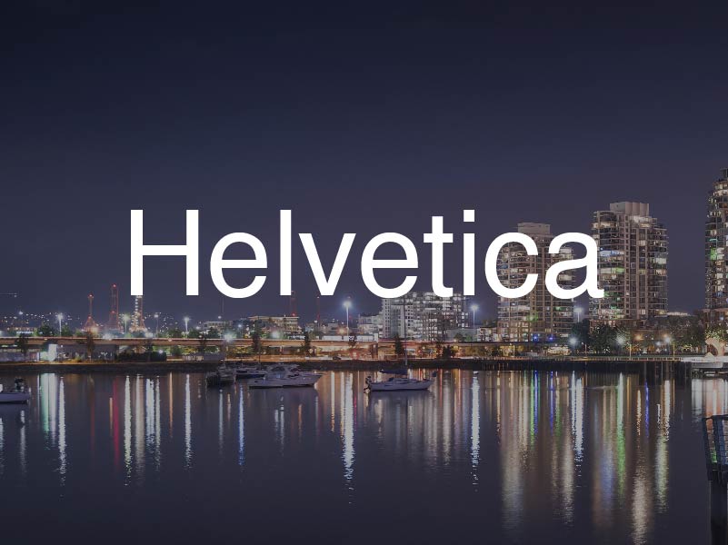
11. Helvetica
This font was built in the 20th century by Eduard Hoffmann and Max Miedinger. Due to its set of lines and layouts, it offers neutral and concise design and often linked with modern graphic design. Helvetica is one of the most used texts among professionals.
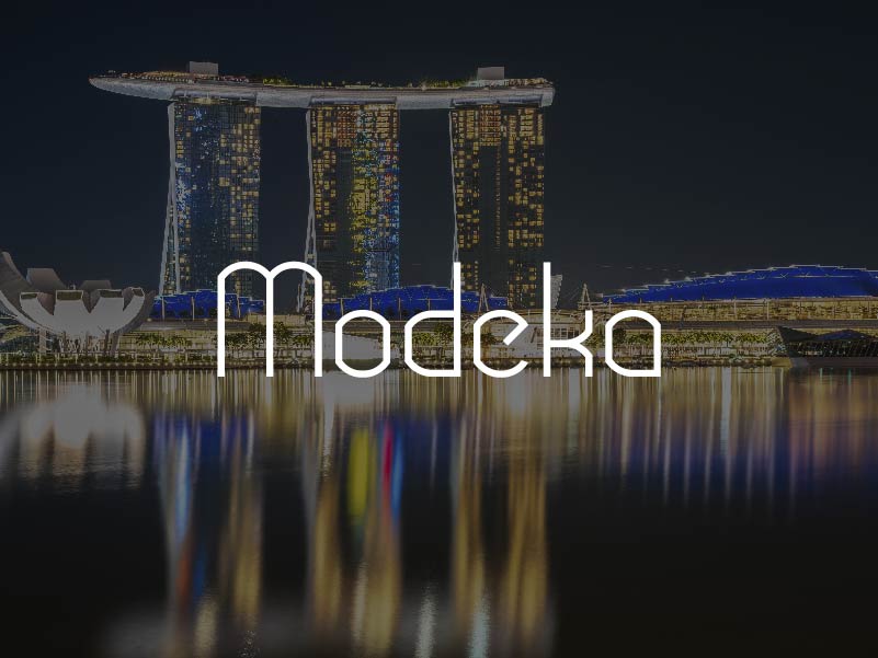
12. Modeka
This cool clean or modern style custom font is from Gatis Vilaks. This font is perfect for those who prefer versatile yet subtle fonts for composing their boards. It is great for titles, subtitles and textual details in the graphic composition of boards and drawings.
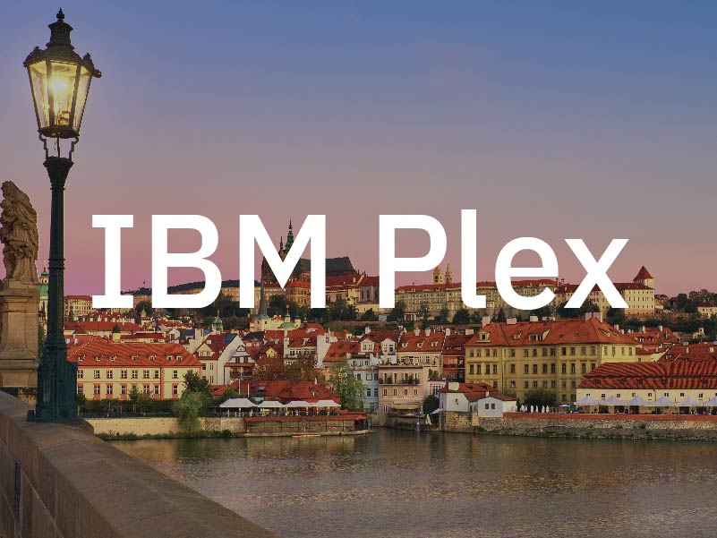
13. IBM Plex
Developed by Mike Abbink this font is the corporate typeface for IBM worldwide. It was developed at IBM in collaboration with Dutch type foundry Bold Monday mainly to reflect the brand spirit. Plex was released as an open-source project in 2017 and includes Sans, Sans Condensed, Mono and Serif.
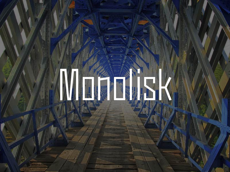
14. Monolisk
This font was developed by Studio Buchanan after being inspired by Eastmodern and Brutalist architecture. Monolisk is a very sturdy and powerful font with the gothic typeface. It comes in 5 different weights plus stylistic alternate glyphs to truly broaden your horizons.

15. Gamba
This font was developed by Juraj Chrastina. Gamba is a clean font with a subtle square personality. Highly legible no matter the size, it’s clean and practical for every design work.
Thank you for reading. We hope these fonts narrow down your search for the best architecture font for your architecture endeavors.
Interesting Read: Namaste Tower In Mumbai – 7 Interesting Things
Curated by a building expert from Wienerberger India