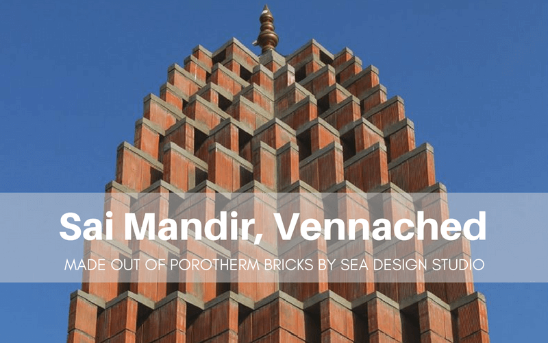
If you look at the temple of Sai Mandir in Vennached, it looks like a distilled version of just any traditional Hindu temple- being a simple religious building which consists of recognisable elements like gateways, circumambulation bath and sanctum. On the other hand, what in fact makes this place of worship unique is the creative and extended role it plays in the remote village situated west of Hyderabad. Wrapped in Porotherm brick tracery, the generous design has turned this sacred space into an inviting and desirable social arena. SEA – Studio for Environment and Architecture has creatively juxtaposed changes and continuities, articulating innovation and underpinning traditions from the long history of temple building.
buy me a boat lyrics The Project: SAI MANDIR
Sleman Location: Vennached, Telangana State, India
Designed by: SEA – Studio for Environment and Architecture
Walling Material used: Porotherm Smart Bricks
Plot area: 320m2
The project was completed only a few months ago, has been dedicated to Shirdi Sai Baba. He is a well-known saint who lived and preached in the late 19th and early 20th centuries. Hindus in many such villages and towns respect and regard God and ‘godmen’ alike and make no distinction when it comes to building sacred structures. At times, the temples built for godmen (there are very few god women) are grander than the ones which are dedicated to the gods.
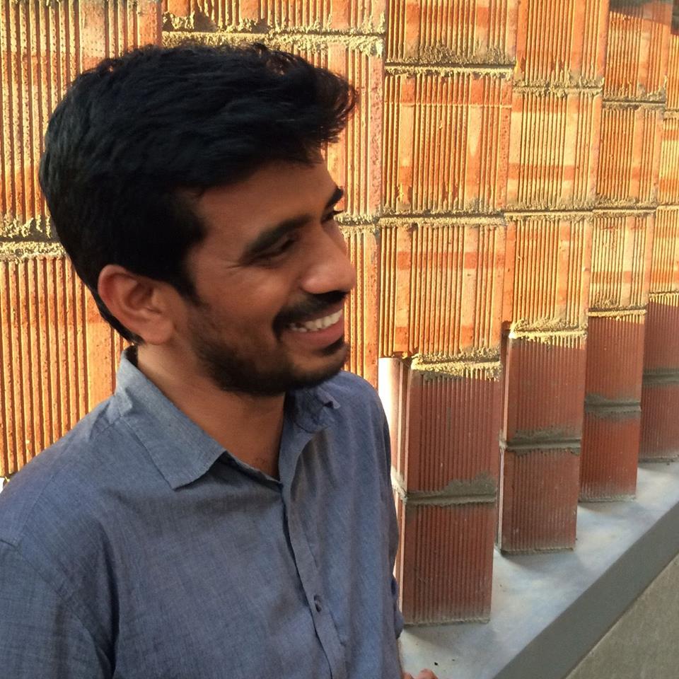 (K Hari Krishna, Principal Architect - SEA)
Hari Krishna, who is the principal architect of the SEA is agnostic about faith and rituals and has never designed a temple before. ‘Lack of experience or views about religion did not impede the design,’ he insists. ‘Any sensitive designer can evoke the sense of the sacred by remaining alert to the relation between nature and architecture. Light, scale and site-specific natural features are critical to achieving this’.
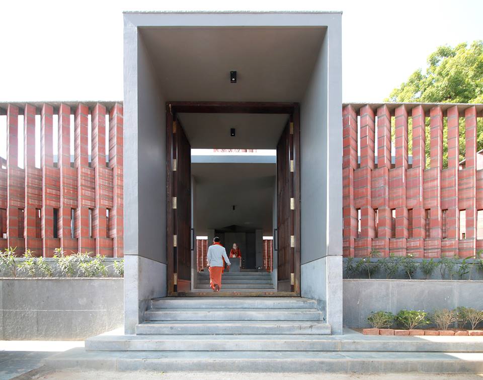
Most of the traditional elements of a temple have been retained by Krishna’s design for the Sai Mandir. The temple features: boundary walls that clearly delineate the sacred space, circumambulation passage, orientation to cardinal directions, axial entries heralding a sequential movement to the sanctum, towers over the sanctum and articulated gateways.
Working alongside one of the patrons who had initiated and substantially funded this project, they agreed not to upset these essentials in their process of building a new temple. However, the design did not merely reproduce traditional elements; it also made a few critical departures.
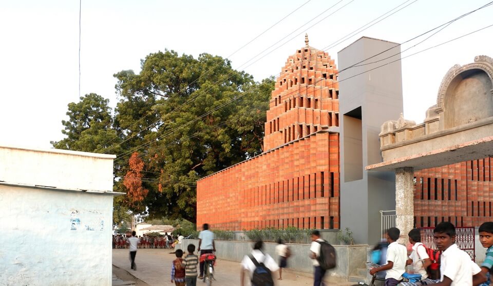
The innovation began with the delineation of boundaries. Unlike the usual opaque solid wall, which is historically derived from royal and military paradigms, the encircling walls at Sai Mandir are actually porous. Delineating the sacred space was necessary, but letting the wall sever the connection with the adjacent public place would have isolated the temple totally. There are four sets of brick tiers in increasing heights, turned at different angles, that produce a lattice-like structure through which the inside and out permeate. The brick wall also evokes the traditional jali (a perforated screen to help cool the space). The narrow slits built in it, allow fresh breezes to enter and allow people to glimpse through it. The pavilion inside connects with the large 100-year-old neem outside and shares its shade. The sound and light (particularly in the evening) from the inside brighten up the outside. The interior of its open pavilion draws the villagers to worship as well as rest, outside, the raised and the extended plinth provides a place to gather, converse and even conduct business. While men old and young claim the platform around the tree, women and children use the temple plinth and the interior space extensively.
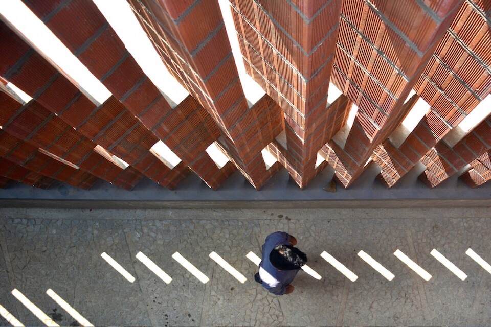
Krishna emphasizes that the key element: light articulates the sacred and views it as the vital link in nature–architecture relationship. Light to him is evocative and he has successfully incorporated it as one of the design’s central features. The narrow courtyard that has been built enveloping the open pavilion with the shrine, and the outer lattice screen, are the major sources of illumination. Light from the top bounces off the overhanging roof, and falls on the zigzag screen walls and ends up creating unexpected patterns. Symmetrical shadows that are wonderfully unpredictable become the ornament. The strip of clear bright blue sky, seen from the open space, sets a perfect contrast. Here, light does not create an aura but repeatedly reshapes the perception of space, making it appear more layered than it is.
Making use of natural and green Porotherm Smart Bricks, which are manufactured by Wienerberger, a world leader in clay building material, aids this experience. The earthy colour accentuates the shadows, the sharp edges articulate the slits in the screen well and the grooved surface adds texture. The bricks perform better climatically too and are more suitable for the high temperatures which are usually experienced in the villages. Bricks also enliven the building, and the red earth hue approaches the saffron colour associated with Hindu ritual objects. Apparently brick was neither the natural nor the first choice in this project, however. Krishna initially prescribed local stone for the outer screen – the patrons and the villagers did not appreciate its grey tone so he replaced it with a brick. The decision has paid off.
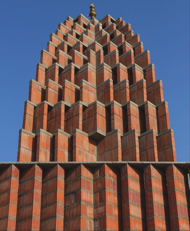
The shikhara which is the tower over the sanctum marks the height of Krishna’s experimentation. It is the sacred high point and an icon in itself. If the tree has been the traditional anchor element and a quintessential feature of the village, Sai Mandir with its jagged shikhara and bright clay-brick walls is a complementary addition.
Typically, the shikhara is assembled as tiers of sculptures culminating in a finial. The north Indian variation is a fractal assemblage of geometric patterns or leaping curvilinear sections but, at Sai Mandir, the shikhara takes a new jagged form.
The geometry is displaced at every tier, which is neither of equal height nor follows a well-worked-out proportion. The emphasis is on the effect of the recess: the eye that anticipates all the edge points aligning and taking a gentle sweep along the surface to the finial, then to the sky, is disappointed. However, the innovation has not been stretched to the extent that it loses its typological meaning. The villagers reverently look at the new shikhara that dots their skyline.
It has been seen that Hindu temple architecture has a long unbroken history. Right from the seventh century, temple architecture flourished at a time when social and religious transformations positioned temple worship as the more accessible and desirable form of religious experience. It developed a rich lexicon of symbols, entwined meaning with form and space, and even had codification in the ancient texts.
Curated by:
Mr. A Srivathsan is an architect and urban designer. He is the Academic Director of CEPT University, Ahmedabad, which focuses on designing and managing human habitats. Srivathsan was a Senior Deputy Editor with The Hindu for eight years before shifting to CEPT University. He holds a doctoral degree from IIT Madras and is a recipient of the Fulbright postdoctoral fellowship. His areas of research and writing include urban planning and policies, and architectural criticism.


